Work / Packaging / Trident / First
Chewing gum, redesigned and tested before launch.
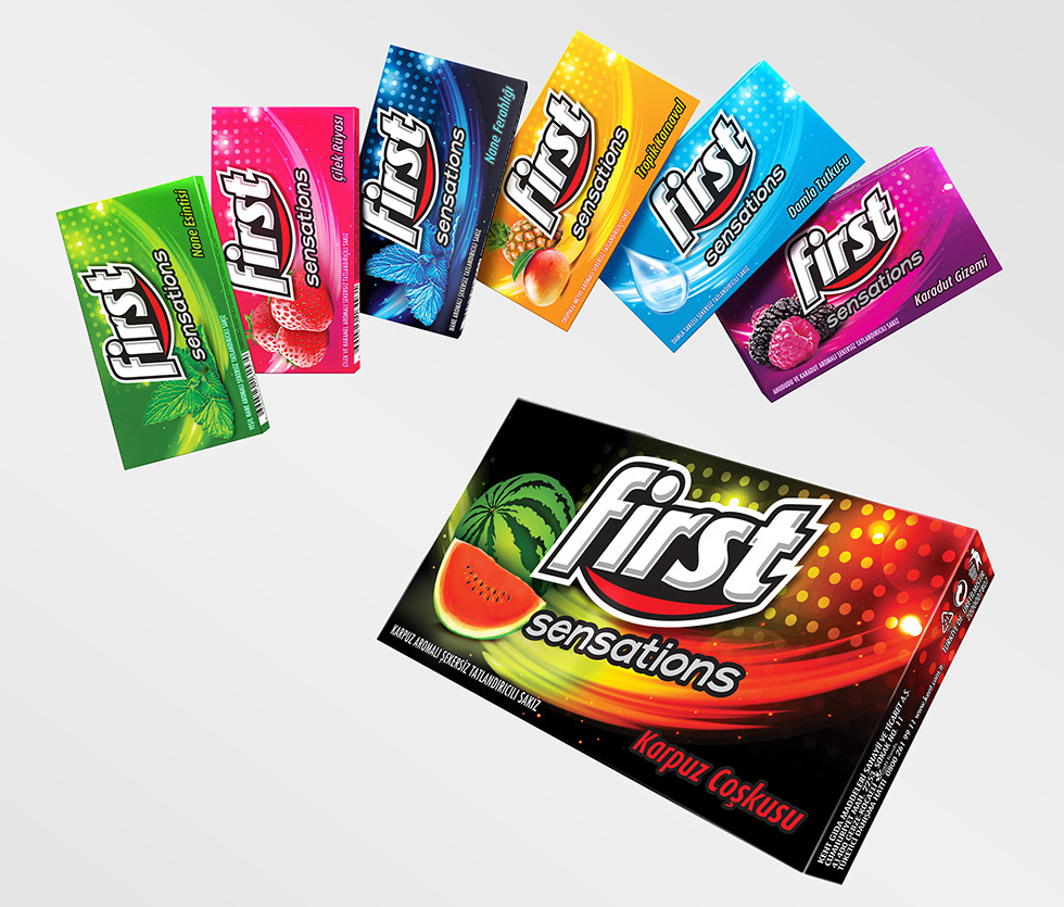
First is the Trident brand in Middle Eastern countries. When Trident changed its branding, I was one of the lead designers who redesigned the new Sensations series, with the First logo adapted to carry the red swoosh that Trident uses.
The rebrand
A new logo, with Trident's red swoosh.
Trident had changed its branding, and First had to follow. The First logo was adapted to carry the same red swoosh, and the Sensations series was redesigned round it.
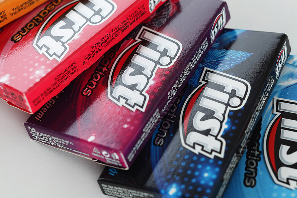
The packs are dark, and the flavour colour runs through them like light. The new logo is set at an angle across each one.
Palette
The palette of the work.
Colour
- Trident red#B52532
- Night#271A25
- Ice blue#465C75
Colours sampled from the work, not a published palette.
Behind the mirror
Tested with consumers, before it reached a shelf.
We worked with IPSOS. The designs were shown to consumers before they were marketed, and I watched from behind the mirror as people said what they thought of them.
Very few designers get to hear that first hand. It is the difference between believing a pack works and knowing what a shopper says when they pick it up.
The illustrations
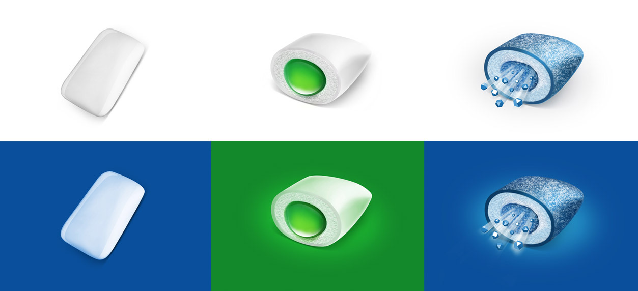
The gum itself, drawn three ways.
What is inside the gum is the selling point, so the gum is the illustration. A plain tablet, one with a liquid centre, one breaking into crystals of ice: each was drawn on white and again on the colour of its pack.